Why One Stadium Map Cannot Show Every Route
A stadium map helps visitors orient themselves; route-specific views clarify how to reach a section, facility or step-free connection without clutter.
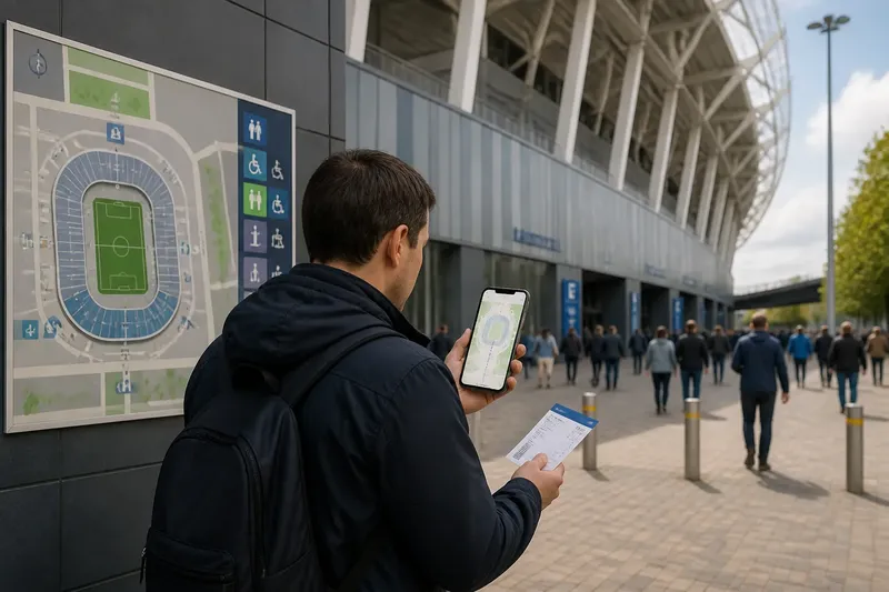
A visitor pauses beneath the stadium’s outer wall, ticket in hand, and turns a phone map towards the building. The plan shows the stand, but not which internal passage leads there. A stadium map can orient people without serving as a complete set of directions; those are different tasks.
The clearest way to design visitor information is to give each view a distinct job. An overview locates major places and explains how the venue fits together. A route view connects a chosen starting point to a destination, showing the decisions that matter along the way. Keeping those jobs separate makes it easier to find useful detail without turning the whole map into a maze.
Map layers
An overview should help a visitor answer questions such as “Where is my stand?” and “Which part of the venue am I looking at?” It can show stands, public facilities, named concourses and surrounding streets. It should not imply that every pair of nearby places is directly connected.
A route view has a narrower purpose. It starts somewhere specific and leads to a named destination, using connections that are available to the person following it. A corridor may pass behind several seating blocks; a wall or controlled boundary may separate spaces that look adjacent on a simplified plan. Showing those distinctions in a relevant route view is more useful than drawing every operational detail on the overview.
Think of the information as a set of compatible layers: a venue overview, a view for the relevant area, and route guidance for a particular journey. They should use the same place names and symbols. They need not appear together on one crowded drawing.
Connections and access
Map design is distinct from entrance equipment and queue management. The visitor-information question is how a person can identify the relevant place on a plan and understand the connection from one mapped area to another. A gate label can locate a point; a route view explains what follows from it.
That distinction matters for accessible movement, too. A wheelchair symbol beside a location does not show whether a step-free connection continues to a seating area, facility or lift. A useful accessible route view traces the connection between relevant places, marks lifts and level changes where they affect the journey, and makes clear when the map cannot settle an individual access question. A venue access team can clarify arrangements that a general plan cannot resolve.
Where there is no direct connection, the map should not suggest otherwise. Mark the boundary or interruption and show the relevant alternative if it is known. Naming a concourse or level can help distinguish passages that would otherwise appear to form one continuous route.
Information by task
Adding more detail does not automatically make a map more helpful. If labels for corridors, services, boundaries and routes compete on a single image, visitors must first decide which information applies to them. A layered approach lets them start with the overview and open or consult a more focused view when they need it.
- Check whether a first-time visitor can identify the named stand on the overview; if not, add a clearer label or orientation cue, or simplify competing detail.
- Check whether the ticket’s place name matches the map; if it does, keep that shared wording, but if it does not, align the names across visitor materials before adding another label.
- Check whether two nearby mapped areas are actually connected; if they are, show the useful link in the relevant route view, but if they are not, mark the boundary and indicate an alternative where available.
- Check whether the route includes stairs or a level change; if it does, provide a suitable step-free route view where one exists, but if its availability is unclear, direct visitors to the venue’s access team.
- Check whether an event-day closure changes the route; if it does, show a current alternative or direct visitors to live assistance, but if the map cannot be updated, make that limitation clear.
- Check whether colour is the only way to distinguish a route; if it is, add names, symbols or line styles, but if the route is already identifiable without colour, keep the presentation simple.
A static overview remains useful even when a digital route selector is available. Phones may be difficult to consult in a crowd or unavailable to some visitors. Printed plans, visible signs and staff can support the same naming system without forcing everyone to use the same format.
Choosing the right view?
What should a stadium overview show?
Show the main stands, public facilities and orientation cues such as nearby streets or the forecourt. Keep the connections between areas honest: proximity on a plan should not be mistaken for an open route.
Should a map show every corridor?
Include a corridor when it helps answer a visitor’s question at that scale. Put finer internal connections in an area or route view rather than burdening the overview with detail most readers do not need.
How can closures be shown?
When a closure changes a route, show the affected connection and a current alternative if one is available. If a printed plan cannot reflect event-day changes, point visitors to signs, staff or a live information source.
Can a phone replace a printed map?
A phone can show a selected route or updated information, but it may not be available or convenient for every visitor. A legible static overview, consistent signs and staff assistance provide other ways to understand the venue.
A mapped journey
Say a visitor has a ticket naming the East Stand and wants to reach it without using stairs. Starting with that ticket, they look for “East Stand” on the overview; it appears beside the east side of the venue. They then open the area view, which names the connecting concourse, and select the step-free route view, which shows a lift before the seating area. At the lift, a sign uses the same concourse name. The resulting guidance connects the ticket’s destination to a usable route, while leaving event-day changes to current signs or staff rather than pretending the map can predict them.
When reviewing a stadium map, follow one named journey from its starting point to its destination. Check whether the map’s labels agree, whether each connection is real and whether another view is needed for a particular access requirement. A stadium map is most useful when its overview gives visitors a reliable sense of place and its route views answer the narrower question of how to get there.